
Saturday 19 May 2012
Happy pills..?
It is now less than 48 hours to my deadline for handing in my final major project. I have randomly decided that I need some more drawing work for my sketchbook, which is a little crazy to say the least...what is more crazy is that I am drawing pills...think Mr.Freud would have something to say about that!!
 To be fair I did look at these as inspiration in my initial visual research, I loved the colours and shapes, but also along with my theme, the gritty and pretty nature of drugs. I like the idea that they are so tantalisingly pretty, yet their functionality may often be dark and edgy. I think there is a parallel between this and the fairground, where all is not how it first appears. I only wish I had drawn this sooner, think it would have been amazing for pattern development as a motif. I have really enjoyed using this technique which I hadn't tried before which involves blending graphic markers with soft pencil- it really works well. It's definitely something to put on the back burner.
More fashion illustration...
I have been experimenting a little further will fashion illustration, in this instance I have drawn the whole figure, but left the face blank. I will develop these drawings further and experiment with using backgrounds and texture in my final pieces. The thing is I'm getting a real buzz out of it and am already thinking I might find myself a life drawing class...just another thing to my ever growing list of classes I want to do!! The garment in this illustration is taken from a design I posted earlier which I intend to construct into this oversized style of tunic top which is longer at the back. I will be putting the same print in the back, but rescaling it to accomodate the extra length. I have already printed the front in pure silk, it drapes amazingly and is feels so luxurious. Can't wait to see it finished.


Attempting fashion illustration!!

Well I have positively avoided fashion illustration until now...but wanted to show my work in a more diverse way than just technical flats. It is definitely a skill I need to hone and hopefully will improve with practice. I felt very apprehensive about drawing people, but enjoyed it once I got going..take a peek at my first drafts! All of them need a tweek or two (or maybe more) but feel proud at having a go anyway.

Thursday 17 May 2012
Collagerific!!
I have discovered these stunning collages by Jill Ricci today and I have to say I am tad bit jealous of these pieces as I had envisaged that I would produce some beautiful collages in this kind of vein with my circular discs. Feeling a bit sad that I haven't developed my drawing and painting more prior to starting my digital work, but I guess it's all about keeping on track with the schedule. I do really struggle with this I think I would carry on developing till I keeled over sometimes. So often feel that I could run and run with ideas. I do think this is a good thing, but you do have to know when to stop and work on the final outcome!! I will definitely have to put strategies I place to help me do this when I work as a freelance designer and have to work without college deadlines...!


Jill Ricci
Wednesday 16 May 2012
Destination Frock...!

Where I come from a dress is known as a "frock" and that's exactly where this print is headed! In spite of setting out to contain myself to a scarf collection, I found the urge to create some garment fronts overwhelming and even then felt they should be whole garments to do them justice. This will be keeping me busy for the next couple of weeks as I finish my products and designs for my final show! I love the fact that this print incorporates the idea of layering which was my original starting point but also incorporates fragments of other patterns I created. It feels that the design encapsulates different points of the design process and feels quite organic because of this.
Tuesday 15 May 2012
Development...

 I have also been playing around with one of my newly finished scarves. There is so much scope for how they can be used. I initially thought it was a bit crazy to make it 100cm x 100cm...but know I think it's the perfect size and have found doing research that there are an abundance of scarves this size, probably because there is so much scope for how to wear it. Hopefully there will four more to add to this tomorrow if all goes to plan in the print room.
Market research...
I have following one of my lovely fellow students work on http://urban-peacock.blogspot.co.uk/ and noticed she had posted some lovely images of accessories on http://www.bottica.com/...I checked out the site and found a whole bevy of beautiful scarves that I hadn't encountered in my previous trawl of research...here is a taster of what I found!!!


Cvetaeva
milleneufcentquatrevingtquatre
Ver Flora
Ayako
Thursday 10 May 2012
Nicola Kirkwood
Surface design...how do I love thee....I never ceased to be amazing how beautiful things look with a bit of print...I love the idea of being involved in a collaboration to design print for shoes...would really be just up my street...check out these beauties by Nicola Kirkwood....! Think I may be getting a little distracted...not like me at all ;)


Wednesday 9 May 2012
Cutting it...!!
I am getting a wee bit anxious about deciding how to design my garment fronts...need to bash on now my prints have finally been transferred on to fabric. Thinking tops and possibly a skirt, which I haven't done for a while.... research, research, research...

www.stylebistro.com
 www.stylebistro.com
Also coveting this gorgeous print by Reem Acra...utterly delicious. Starting to think about shapes and silhouettes to fashion my own prints...keeping in simple is going to be the key to success!
Vera Wang
www.stylebistro.com
Totally loving this print by Vera Wang which I found on my latest round of research!
Reem Acra
Also coveting this gorgeous print by Reem Acra...utterly delicious. Starting to think about shapes and silhouettes to fashion my own prints...keeping in simple is going to be the key to success!
Monday 7 May 2012
More, more, more...

Feel like I am really start to get there now with my final outcomes, this design is almost certainly destined to become a garment front. I am really happy with this piece, as it think the colour palette, blending and pattern mixing work really well. Planning on printing it tomorrow all being well!! Thoughts are to create a tunic style top or vest. the question after that will be to decide whether to go to embellish it further?? Thinking that some delicate stitch or demure beadwork will look good in the central area.

Another proposed garment front for different style top and with slight variation in colour palette.
Feel that this may need some extra pattern added to the lower area, but keen to sample the colour palette in print.
Saturday 5 May 2012
Digital distraction....
Well I was full of energy to start stitching, but have been somewhat distracted by a need to resolve some of the issues in my digital prints. Basically I am not happy with the outcomes I have achieved so far and feel that they merit some extra TLC. Think I need to confess I am just a bit of a perfectionist, but I am in good company, I read recently that one prominent fashion designer's mantra is "Must do better"!! So I am going keep on reaching for the sky for a wee while longer, but for now this is the next development of my candy rock scarf... I am actually rather fond of it already! Think I will be tweeking the background a tad, but so far so good. Loving the colour palette though...

I have been really inspired by my new top I got yesterday which I totally and utterly adore from Topshop...it's so yummy!!!


I have been really inspired by my new top I got yesterday which I totally and utterly adore from Topshop...it's so yummy!!!
Thursday 3 May 2012
Heaven is a place called Stitch...
Wasn't going to blog anymore today...need to get cracking with lots and lots of work, I couldn't however sign off in all good faith without sharing this work which can seriously only be described as DIVINE...hook, line and sinker have I fallen for the work of Yumiko Arimoto... it is really breath takingly beautiful...pure, delicate, restrained, sophisticated...not sure how many more adjectives I can find to describe it. Well just see for yourself...


http://anabundanceof.blogspot.co.uk/


http://anabundanceof.blogspot.co.uk/
On the right track...
I think it's really important to keep checking in with your visual research throughout the course of a project because it's so easy to "go rogue"! I decided to review my body of work against trending websites just to check I had not gone too far adrift. I was delighted to find I was bang on track and felt relieved to find this link which supports the work underpinning my designs...think it really gathers the whole essence of what I am trying to achieve...


http://www.fashionising.com/


Multi-tone prints: spring’s kaleidoscopic trend.
As spring 2012 warms the air, the fashion industry dips its fingers into the artistic tub for inspiration and guidance. Clothing becomes the new canvas for abstract art and splashes of prints that are as quirky as they are colourful.
http://www.fashionising.com/
I absolutely adore this print by the extraordinarily talented Mary Katranzou. I aspire to produce as beautiful digital prints as this one day...I love the mismatched harmony that comes from contrasting scale and photographic and illustrated work...sheer brilliance! Keeping on trucking with my own digital prints including this new creation...

As you can see this design is a development of one I previously posted. I created this all digitally not a scrap of drawing- all solely by manipulating scanned rock and mixing with my shibori samples. In mine mind this is more successful than the long thin scarf because there is greater contrast and I feel the square works better for the design, giving it a more successful composition. Think this one will almost certainly be in my final collection. I love how graphic it is and I think mixing the gritty urban tones with the soft pastels makes it more edgy and contemporary. I am going to consider some carefully placed embroidery and also overlaying clear foils by screen print. Do need to think carefully about size...the bigger the better methinks!
Tuesday 1 May 2012
How I miss u stitch...!
I have been yearning to do some sewing and embroidery lately, but felt I needed to finish my print work first before I started creating my embellishment. I haven't finished printing yet, but I feel I need a change of scenery so to speak... I am truly inspired by the work of Marit Fujiwara, whose fabric manipulation and embroidery is just phenomenal. When I revisited Marit's work I was enthralled by how reminiscent of my visual research on layered things. It has got me thinking about being more adventurous with my stitch and embroidery work. I plan on experimenting with creating my own layering by attempting some fabric manipulation of my own mixed with some machine embroidery and print- watch this space!


Marit Fujiwara
http://www.stylebubble.co.uk/
Just noticing how similar this design is to the look of quilling...obviously riding on the same vibe with all this imagery!
Just noticing how similar this design is to the look of quilling...obviously riding on the same vibe with all this imagery!
Allison Watkins
Another new and amazing find this week has been the work of Allison Watkins...wow the varied use of stitch and colour...it just sings! Am musing over this type of embroidery in my work...obviously it is used in a very illustrative way in Allison's work but I love how linear it is and the use of tone in the thread. I am wondering whether it would look fab mixed in an abstract way over print...? Need to stop procrastinating and get sampling...can't think these things into being...pity!
Circles circles circles...going round in circles???
Feeling quite dizzy, as I seem to keep revisiting my circle idea, not quite sure why I keep being drawn back to experimenting with circles? I just love them...now to work out whether layers and circles should be combined or just have layers within circles, or something of the sort...confused.com!!


Monday 30 April 2012
Candy rock, candy floss and a very sticky scanner...!!
Glued I have been to my lovely Mac, engineering prints for my scarves! Yesterday I was really naughty and sandwiched some broken bits of rock (the sweet candy version) in my scanner...I will be in so much trouble! I manipulated the images into kaleidoscopic images, rotating and flipping, enlarging and reducing.


Tuesday 24 April 2012
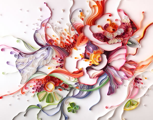
Yulia Brodskaya

Contrast...
For a long time I have been a huge fan of Claudia Carviezel's work...I love her ability to show such diversity and her amazing use of colour! Basically she shows no fear in her work...and if bold is required, bold is what is delivered. I revisited her body of work again today as I was having an inner battle with colour palette. I have found lately that having learned to be restrained in use of colour I am now a bit fearful about being indulgent with it. This has been true with my new scarf designs where I have gone backwards and forwards to try and find a happy blend of vintage delicacy and contemporary boldness. The truth is I haven't been sure if I am finding a happy medium? However, looking at Claudia Carviezel's work again has been me think that ultimately the design needs to be fit for purpose. In this instance I want my scarves to be interesting and stimulating when they are worn not just to look at as a whole design. For me this means good use of contrast in the design when draped around the neckline. Going to keep experimenting to find that elusive all important balance!

Monday 23 April 2012
View through the telescope...

In a previous post I shared about my litte enchanted evening at sunset on Blackpool North pier. At the end of the pier was this telescope and it immediately gave me some inspiration for a design. I started to think about how the image seen through the viewfinder captures a small aspect of a whole picture or scene and how when this is narrowed down that the image becomes magnified and the sole focus of attention. I went on to muse over how this could also relate to different aspects of time and different eras and considered how all these things could be explored in varied scale and blended together within a design.

I started to collect together drawings and old and new photos and capturing little circular snippets which best represented the overall image. It was really great fun and I could have gone on and on with this concept. Here is the first draft on the design, which incorporates the backs of old photos, line drawing and ink patterns along with a little bit of text (which I will probably omit in further development) as I think it makes the design look too contrived?
Saturday 21 April 2012
New scarf design...

market.
Friday 20 April 2012
My street art...

Jose Romussi

Thursday 19 April 2012
Lakeca Mixed Media Illustrations...
Perusing the internet today I stumbled across these amazing illustration using mixed media techniques by Lakeca. I absolutely love them and feel like I had another eureka moment as I feel it is what I have been trying to achieve with my own work incorporating pattern and hand drawing along with photographic elements. I think further experimentation with this is definitely help me to get to my final outcome. rolling my sleeves up as we speak for an afternoon of collage and drawing!


Wednesday 18 April 2012
Hand and Lock...Epic adventure

 |
http://lindalightleyunit3.blogspot.co.uk/ |
Tambour beading
I love this example of tambour beading on tulle by Linda Lightley. I love the mix of different colours of beads and sequins. I found the technique very tricky as it seems like a sort of cross between sewing and crochet. It was so easy to get the hook caught on the delicate fabric and to lose all your stitches. I will definitely pursue it as a technique as the finished result is so worth it. Practice makes perfect I guess, so I have already bought myself a hoop with a stand to get started.Prick and pounce...
I have long been a bit bemused by how to transfer embroidery designs properly and so have usually drawn them onto dissolvable stabiliser which can be washed away. I have finally found that the correct way for image transfer is the "prick and pounce" method which involves overlaying the design onto the chosen fabric usually on tracing paper and then pricking the paper over the design. A chalky powder called pounce is then rubbed gently over the design leaving the outline of the design on the fabric which can be joined up by a suitable pen or pencil. Just wish I had learned this sooner!!
Subscribe to:
Posts (Atom)